Grew up on cartoons and comic books. Built on pop culture, nostalgia, and a bit of rebellion. ILLESTRAIDER is my home for illustrated apparel, original graphics, and custom design.
Shouting "Art for sale!" out of my dad's car sunroof at age three before I even knew what being an artist meant.
02
Early Encouragement
My father laminated my drawings—teaching me early on that creativity was something worth keeping.
03
The Hard Lesson
Learned that talent is only half the battle; building a living takes consistency and relentless effort.
04
Finding the Canvas
Realized the T-shirt is the ultimate canvas—where illustration, story, and everyday life meet.
Designing for the Storefront
From 2016 to 2023, I worked as the lead designer for several online print-on-demand stores, creating graphic apparel and merchandise. I learned how to take an idea from sketch to a design that reads clearly on a storefront and holds up on a garment.
Working across different stores taught me to think in collections. I’d start with a story, figure out which ideas belonged together, and adapt the artwork to the products that carried it best. That’s the approach I bring to the collections I develop for brands today.
Illustration meets Jiu-Jitsu.Two apparel graphics created for JNGL Athletico, bringing Western imagery, bold lettering, and the brand’s “Just Never Give Less” attitude onto heavyweight tees. Texas Jiu-Jitsu and Never Quit combine custom illustration and typography with garment placement and print specifications.
Graphic Design
VALOR — Baseball Bat Graphics
Stinger Sports’ contest brief called for graphics for VALOR, a two-piece hybrid BBCOR baseball bat aimed at high school and college players. The direction was clear: a patriotic red, white, and blue palette, kept simple and clean.The central task was to give VALOR its own recognizable wordmark. The name needed to work independently as a logo while sharing the product with Stinger’s existing combo logo. The brief placed VALOR on one side of the barrel and the Stinger identity on the other.My work focused on the wordmark, typography, color arrangement, and barrel graphics—bringing the model name and the established brand together without overcrowding the bat. The red, white, and blue treatment creates a distinct identity through lettering and placement rather than elaborate patriotic decoration.The project is presented through graphic views and technical artwork showing how the design wraps and reads across the bat. Stinger’s product page provides the manufactured product context; the bat’s construction, engineering, and BBCOR certification belong to Stinger Sports.
The founder of Thirty Three Digital commissioned me to create a collection of apparel graphics for the agency’s client, Nomad Outdoor, an outdoor lifestyle and hunting brand.The collection draws on Southern hunting culture, backroad adventures, truck-stop aesthetics, and heritage outdoor traditions. Working with Thirty Three Digital’s creative direction, I developed graphics for apparel, headwear, and promotional products while maintaining consistency with Nomad Outdoor’s brand identity.
Western characters and Jiu-Jitsu culture meet in two apparel graphics, pairing bold illustration and lettering with finished tees and production references.
Illustration meets Jiu-Jitsu.
Two apparel graphics created for JNGL Athletico, bringing Western imagery, bold lettering, and the brand’s “Just Never Give Less” attitude onto heavyweight tees. Texas Jiu-Jitsu and Never Quit combine custom illustration and typography with garment placement and print specifications.
Illustration meets Jiu-Jitsu.
Two apparel graphics created for JNGL Athletico, bringing Western imagery, bold lettering, and the brand’s “Just Never Give Less” attitude onto heavyweight tees. Texas Jiu-Jitsu and Never Quit combine custom illustration and typography with garment placement and print specifications.
Client
Alex TaylorFounder, JNGL Athletico
Services provided
Illustration
Apparel Graphics
Custom Typography
Print Specifications
01 / Texas Jiu-Jitsu
Texas roots. Jiu-Jitsu spirit.
A cowboy in a gi rides a white tiger across a Texas silhouette. Distressed red lettering and a blue backdrop give the illustration a strong regional identity, while the martial arts details connect it to JNGL’s audience.
Original illustration and typography. Red, blue, and black create a bold composition on a white ground.The Texas Jiu-Jitsu graphic applied to JNGL Athletico’s heavyweight tee. Product image courtesy of JNGL Athletico.
Texas Jiu-Jitsu — white tee artwork and placement tech sheet, Revision B. Print specifications and placement are pending approval. Select the image to view the full-size sheet.
02 / Never Quit
Just Never Give Less.
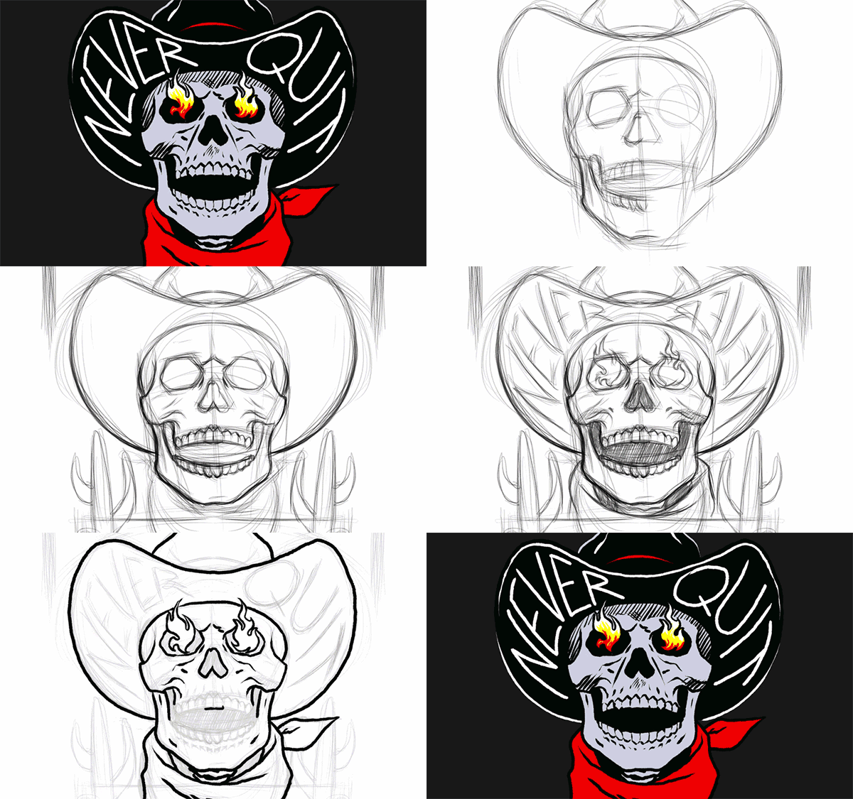
A cowboy skull with flaming eyes anchors the Never Quit design. Hand-drawn hat lettering, a branded red bandana, and cactus details build a Western character around JNGL Athletico’s message of persistence.
Never Quit artwork. White linework and lettering stand out against black, with red and green accents.
The full graphic on the back of the heavyweight tee. Product image courtesy of JNGL Athletico.
Never Quit / Sketch process
From sketch to skull.
A timelapse of the Never Quit skull illustration, showing the drawing process behind the finished apparel graphic.
Never Quit — illustration sketch timelapse.
03 / Artwork handoff
From illustration to placement.
The Never Quit handoff brings the complete back graphic and a simplified left-chest mark into one production reference, with garment mockups, placement labels, and color specifications.
Left chest
A reduced cowboy skull and bandana mark keeps the front focused. Color references: White and 485 C red.
Full back
The complete illustration includes the arched brand name, cacti, and supporting lettering. Color references: White, 485 C red, and 355 C green.
Never Quit artwork handoff and garment placement sheet. Tap the image to open the full-size reference.
Illustration and apparel graphics by Ade Deen / Illestraider for JNGL Athletico. Brand identity and product photography shown for context; product images courtesy of JNGL Athletico.
Graphic Design
VALOR — Baseball Bat Graphics
A standalone VALOR wordmark and clean red, white, and blue barrel graphics for Stinger Sports’ hybrid BBCOR baseball bat, developed around a contest brief for high school and college players.
Stinger Sports’ contest brief called for graphics for VALOR, a two-piece hybrid BBCOR baseball bat aimed at high school and college players. The direction was clear: a patriotic red, white, and blue palette, kept simple and clean.
The central task was to give VALOR its own recognizable wordmark. The name needed to work independently as a logo while sharing the product with Stinger’s existing combo logo. The brief placed VALOR on one side of the barrel and the Stinger identity on the other.
My work focused on the wordmark, typography, color arrangement, and barrel graphics—bringing the model name and the established brand together without overcrowding the bat. The red, white, and blue treatment creates a distinct identity through lettering and placement rather than elaborate patriotic decoration.
The project is presented through graphic views and technical artwork showing how the design wraps and reads across the bat. Stinger’s product page provides the manufactured product context; the bat’s construction, engineering, and BBCOR certification belong to Stinger Sports.
Stinger Sports’ contest brief called for graphics for VALOR, a two-piece hybrid BBCOR baseball bat aimed at high school and college players. The direction was clear: a patriotic red, white, and blue palette, kept simple and clean.
The central task was to give VALOR its own recognizable wordmark. The name needed to work independently as a logo while sharing the product with Stinger’s existing combo logo. The brief placed VALOR on one side of the barrel and the Stinger identity on the other.
My work focused on the wordmark, typography, color arrangement, and barrel graphics—bringing the model name and the established brand together without overcrowding the bat. The red, white, and blue treatment creates a distinct identity through lettering and placement rather than elaborate patriotic decoration.
The project is presented through graphic views and technical artwork showing how the design wraps and reads across the bat. Stinger’s product page provides the manufactured product context; the bat’s construction, engineering, and BBCOR certification belong to Stinger Sports.
Client
Stinger Sports
Services provided
Logo Design
Custom Typography
Product Graphics
Color Direction
Artwork Layout
VALOR wordmark and bat graphics by Ade Deen / Illestraider for the Stinger Sports design contest. Stinger Sports’ existing logo and brand marks belong to their respective owner. Product engineering, manufacture, and certification by Stinger Sports.
Custom lettering and heritage-inspired graphics connect Nomad Outdoor’s tees and headwear into one collection, commissioned through Thirty Three Digital and developed across colorways, patches, and garment applications.
The founder of Thirty Three Digital commissioned me to create a collection of apparel graphics for the agency’s client, Nomad Outdoor, an outdoor lifestyle and hunting brand.
The collection draws on Southern hunting culture, backroad adventures, truck-stop aesthetics, and heritage outdoor traditions. Working with Thirty Three Digital’s creative direction, I developed graphics for apparel, headwear, and promotional products while maintaining consistency with Nomad Outdoor’s brand identity.
The founder of Thirty Three Digital commissioned me to create a collection of apparel graphics for the agency’s client, Nomad Outdoor, an outdoor lifestyle and hunting brand.
The collection draws on Southern hunting culture, backroad adventures, truck-stop aesthetics, and heritage outdoor traditions. Working with Thirty Three Digital’s creative direction, I developed graphics for apparel, headwear, and promotional products while maintaining consistency with Nomad Outdoor’s brand identity.
Client
Thirty Three DigitalCommissioning agency for Nomad Outdoor
Services provided
Logo Design
Branding
Typography
The collection / Typography
A collection connected by type.
The starting point was Nomad’s existing identity. Five related serif treatments explored how its letterforms could develop into a wider graphic language, giving individual designs their own character while keeping the collection connected.
Original custom typography studies, retained from the collection presentation.View the original typography introductionOriginal presentation board: a collection unified through type.
01 / 10 PT Badge
An outdoor emblem.
Antler imagery and Nomad’s angular emblem come together in a circular badge. The Black and Moss tees show the same design in two garment colorways.
A framed Nomad wordmark draws on the feel of traditional store signage. The same graphic language carries from the larger tee print into a compact headwear patch, with the color variations grouped together.
Layered lettering, decorative edges, and a shield-like silhouette give Southern Grit its heritage character. The pocket tee and camo mesh trucker show how the design translates between a back print and a headwear patch.
Southern Grit Pocket Tee — Overland. View product ↗Southern Grit Camo Mesh Trucker — Mossy Oak New Break-Up. View product ↗
04 / We Hunt These Woods
Let the lettering lead.
Bold, slanted lettering makes the message the main graphic. The Moss and White applications show the treatment across contrasting garment colors, while the original placement reference connects the design to the chest and back print areas.
Original placement reference with green and white garment studies, print dimensions, and color callouts. Select to inspect the full-size sheet.
05 / Southern Heritage
Heritage lettering in the field.
Arched Nomad lettering gives this headwear treatment a straightforward heritage feel. The tonal embroidery sits directly on the Mossy Oak Bottomland crown, letting the lettering and camouflage work together.
Southern Heritage Trucker — Mossy Oak Bottomland. View product ↗
06 / Fast Times
A faster take on the wordmark.
Slanted, outlined lettering gives the Nomad name a more energetic treatment. Orange and green details connect the embroidered graphic to the Silver Birch cap’s contrasting rope trim.
The original lifestyle collage brings the collection back into its outdoor setting, showing how the lettering and headwear treatments work together on finished products.
Original collection lifestyle collage. Product and lifestyle photography courtesy of Nomad Outdoor.
Commissioning agency: Thirty Three Digital. End client: Nomad Outdoor. Apparel graphics created by Ade Deen / Illestraider.
THE WORK & THE STUDIO
Two ways to explore.
01 / THE GALLERY
Selected Works
A collection of illustrations, graphic designs, apparel artwork, and original creative projects. From nostalgic pop culture to original concepts, explore the ideas and artwork behind ILLESTRAIDER.
Entry 001 · USA 1ST Hockey COVER LOOK Featured: USA 1ST Miracle Hockey Jersey. 250 years of choosing peace over entanglement. The USA 1sters™ collection...